
Sunday, 27 February 2011


Wednesday, 23 February 2011
'XXL' Front cover analysis

The masthead ‘XXL’ catches your eyes immediately especially through the use of the red background as it is bright and stands out the most. The typography is bold and large this shows that it is aimed at males as these represent masculinity. The use of diamonds for the masthead connotes wealth and ‘bling’; these two are usually used to represent R&B and ‘gangster’ and therefore it is easy to indicate the target audience. The way the masthead is behind the main image and not fully shown shows that it is a well known magazine therefore most people would know the magazine name and so does not need to be fully shown.
The main cover line ‘Baby & lil Wayne’ is written in big font which connotes how big these two artists are, anyone who is into the genre R&B will very well know both the artists. Using these two artists in the front cover of the magazine attracts lots of people’s attention as they are very well known, this way they will get more people wanting to buy the magazine because they have lots of fans and people are interested in reading about them and knowing the latest gossip about the two.
The additional cover lines/cell lines include ‘Survival of the fittest’ this has a red background which makes it stand out, the use of the red represents blood which links to ‘the survival of the fittest’ as you have to fight your way to survive. They are saying that they have survived the music industry and are top of the top, the fittest. The cell lines on the side of the magazine have names of other R&B artists such as 50 Cent and Eminem; this is to tell the audience of the other artists that are included inside the magazine so that the audience knows what they are buying. This way they can also get more audience because they have included lots of artists and so there will be some people buying the magazine for 50 Cent and others buying the magazine for Eminem or some buying it only for T.I.
The puff at the top of the magazine says ‘A decade of dominance’ this puff adds to the whole big ‘gangster’ image, it is used to boast about how brilliant the magazine is. They are emphasizing that they have been the top, the best, most powerful, for decades .The use of alliteration with the letter‘d’ catches people’s eyes and makes it more catchy.
The main image/focal point is in the centre of the magazine which makes it the centre of attention, the image is what people first see. From this magazine we can see baby and Lil Wayne with baby’s arm around Lil Wayne as though protecting him, showing us that baby has Lil Wayne’s back. They are both wearing a lot of ‘bling’ which represents the ‘gangster’ image. The logos on the chains are well known logos; this is known as product placement. They are also both topless revealing their tattoos, these tattoos again represent them as ‘gangster’ and also masculine as it shows that they can take the pain of all the tattoos.
This image is homoerotic as it appeals to gay men as well as appealing to women, it appeals to women as women like masculine guys and are attracted to such images, and it appeals to gay guys as the image is of two guys with one guys arm around the other. Lil Wayne is wearing a cap sideways which also represents the ‘gangster’ image as you usually see them wearing their caps sideways. In this image Baby and Lil Wayne look like very stereotypical rap artists through the use of the bling, tattoos and the caps looking tough and masculine. The bling that they are wearing relates to the masthead as the masthead is made out of bling and diamonds which shows them as being wealthy and big.
This image can create an abhorrent reading for some audience as some of the audience may like rap and listen to it a lot but do not like the image it portrays for example on this magazine they have lots of tattoos and are both topless wearing a lot of bling, this may not appeal to some of the audience.
This image could also be an aspiration for some audience as some of the target audience may look up to them and want to be like them.
Front cover analysis - Blender

From looking at this magazine we can see that it looks like an R&B magazine with the use of colours as R&B magazines usually have a white background with coloured and black text. The font of the masthead also gives this away as it is large and bold which represents power. There is a cut through the masthead ‘Blender’ representing toughness which is another connotation of R&B also the use of red as red represent power and control.
The main cover line is about Jay-z one of the most known and famous R&B artist of all time, using such an aspiring artist attracts a lot of attention as Jay-z is known to have many fans who listen to him and who emulate him. ‘The fly life of the American gangster’ this is obviously gossip which is what most people look for in a magazine, people like to read about their favorite artist and be kept up to date with what’s new and again this attracts a lot of audience into buying the magazine. The use of the word ‘gangster’ attracts the target audience who are mainly teenagers as it language they are familiar with and use in their daily lives. ‘Fly life’ gives a little ring to the over line which attracts people and it is something that they will remember because of the ring it has.
‘Wealth! Fame! Beyonce!’ this is stereotypical as R&B artists are usually represented as concerning mostly about wealth, fame and women. This again attracts those who are interested in gossip and those who emulate him and look up to him. This is written in capitals and boxed showing how important it is to artists and that it is their main interests.
The main image is of Jay-z as he is clearly the main topic of the magazine and so anyone who is a fan of Jay-z or finds him inspirational or even those who emulate him would want to buy the magazine. He is wearing a suit which subverts the stereotypical R&B look who are mostly seen wearing hoodies and a lot of ‘bling’ whereas he is only wearing a ring. As he is wearing a suit this could attract a wider range of audience, it would attract those who look for a more sophisticated magazine and still attracts Jay-z fans as they will want to know what the suit is for and what all the hype is about. He is looking at the audience, making eye contact to them as though he has something to say and he has a pretty serious expression on his face which makes people wonder what it could be about. He has slightly lifted his head up representing him to be superior and confident as most R&B artist are represented, he is also slightly looking down at us standing sideways which again connotes confidence and power.
The cell lines include other artists that are in the magazine which attracts a wider range of audience as it attracts Alicia Keys fans as well as Jay-z fans. It also attracts fans of indie-rock music as it includes ‘the 100 greatest indie-rock albums ever’. Adding all this on the front cover attracts a wider range of audience meaning more people are likely to buy the magazine which is what the front cover is for and so succeeds in doing so. The typography is written in black and white, black where the background is white and white where the background is black creating a contrast in colour.
Front Cover Analysis - Vibe

From looking at this front cover we immediately get the impression that it is of an R&B genre because of the colours used; red, blue, black and yellow. Blue is mostly used which relates to the genre R&B as it is known to be chilled and smooth as is the colour blue.
The typography of the masthead ‘VIBe’ is written in the colour blue which is both a male and female colour showing that the magazine will appeal to both genders and so it will attract a wider audience. The way they have written ‘VIBe’ with a small ‘e’ makes it standout as people are likely to notice this immediately. It also makes it unique from other mastheads. The way they have used uppercase and then lowercase in just one letter shows that they are breaking the rules as normally you would not see uppercase letters and lowercase letters used together and so this connotes that R&B is rule breaking and cool.
The main image is of usher suggesting he is the main topic in the magazine, this means usher fans are most likely to buy this magazine as they would be interested to know the latest gossip about him. As he is a well known R&B artist who appeals to both genders and has many fans the magazine is appealing to a wider range of audience. Appealing to both genders is known as being homoerotic, it appeals to women as he is a well known attractive R&B artists recognized by many. He would also appeal to men as some men may find him inspirational or others even emulate him, it would also appeal to gay men who find him attractive.
It is a low angle shot making it seem as though he is superior and as though the audience look up to him making him seem powerful. His head is tilted to the side again emphasizing his power and his confidence of being a successful R&B artist that people look up to. They have used selective focus by blurring the background and focusing mainly on usher making him the main image and again making him seem powerful and important. He is not wearing as much ‘bling’ as other R&B artists usually do but he is wearing sunglasses, a ring and a watch which seems to be a rather expensive watch connoting wealth and a sense of fashion and style as you would see with any other R&B artist. Usher wearing the sunglasses makes him mysterious as he is hiding his eyes, avoiding eye contact making him seem superior to the audience. We can see that usher has a tattoo of a star on his hand which shows his fame and power in the music industry, suggesting he is a star. This could create an abhorrent reading as some people may see it to be rather feminine as it is a star and so some audience although they like usher and R&B may not like the fact that he has a feminine tattoo.
In the main cover line they have used different font sizes, the words ‘USHER’ ‘HE’S NO.1’ have been written in a bigger font to the rest of the text. This makes it stand out most and it is what we first read when we look at the magazine as it looks important because of the font size used. This attracts usher fans as this tells us that the main article is about usher. ‘AND MARRIED WITH A VEGENANCE’ this links to the main focal point in the image of Usher wearing a ring, this tells us that the main story is about Usher’s marriage. This would attract a lot of audience as people like to be kept up to date with the stars and know the latest gossip.
The word ‘swagger’ in written in red making it stand out from the rest of the text as it is the only text written in red. It is also written in graffiti styled text which associates with teenagers and so will attract them more especially as this magazine is aimed mostly at teenagers. Also the use of colloquialism makes it associate with teenagers and so it will attract them as it is language they are familiar with.
Additional cover lines inform the audience of what other topics are included inside the magazine which could attract a wider range of audience for example ’50 cent’ would attract 50 cent fans as well as Usher fans. Also including topics like ‘Keri Hilson strips down’ attracts mostly male audience as they would find this interesting. Repetition of ‘sex’ draws people’s attention and again attracts a wider range of audience as people are interested in reading about this topic, especially teenagers.
Tuesday, 15 February 2011


Friday, 4 February 2011
Music Magazine Intro.
I have decided that I will be making a music magazine of an R&B genre; my target audience will be both males and females although mostly females at the age range of 13-19. I will be promoting a solo artist in the music magazine consisting of the front page, contents page and main article. I was researching existing music magazines and came across ‘Vibe’ which interested me in producing an R&B magazine. The magazine I am going to produce will be neatly laid out with no more than three main colours; black blue and pink. The way in which I am going to make my magazine appeal to my target audience is through the lay out and the colour scheme of the magazine, I was thinking of making it a little busy with lots of pictures to keep the audience interested. Also by adding latest gossip, interviews with the artist, celebrity fashion and posters. I am also planning to add a freebie with the magazine in order to attract people into buying the magazine, freebies such as headphones or posters to attract the target audience.


Music Magazine Questionnaire
Yasmine Al-bayaty
As part of my AS Media coursework, I will be producing a music magazine aimed at teenagers. In order for me to produce a magazine to suit the target audience it is important to carry out a questionnaire in order to know what the target audience look for in a magazine and what they would like for a magazine to include. It would be very much appreciated if you could take a bit of your time to complete this questionnaire.
Please tick the boxes that apply to you.
1. What is your gender?
2. What age group are you in?
13-16
3. What is your ethnic background?
Asian/Asian British
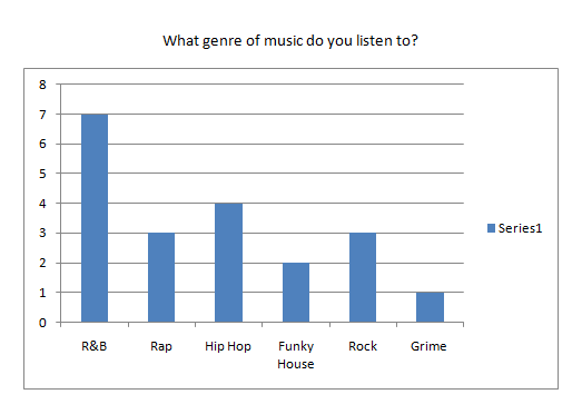
4. What genre(s) of music do you listen to?
5. What TV channels do you prefer to watch?
6. How much are you willing to spend on a music magazine?
7.
Tickets CD headphones T-shirt
8. What features do you like to see in a music magazine?
Latest gossip Posters Events Fashion Interviews
9. What websites do you usually visit when on the internet?
10.
Monthly Yearly Never Occasionally
11. How often do you buy music magazines?
12. Where do you usually purchase your music magazines from?
13. What are your hobbies?
Other _______________________
14. Who is your favourite artist/band?
___________________________________
15. What magazines do you usually purchase?
___________________________________
Subscribe to:
Comments (Atom)