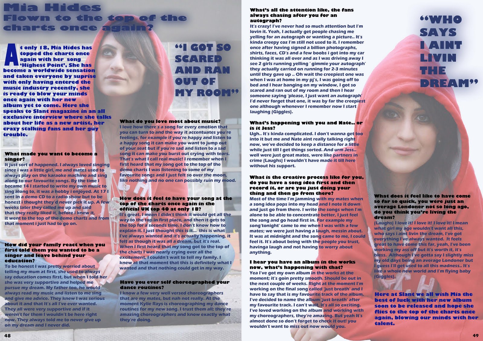
Friday, 15 April 2011

Evaluation - Question 7

Evaluation - Question 6

Evaluation - Question 5

Evaluation - Question 4

Who would be the audience for your media product?


Evaluation - Question 3

Evaluation - Question 2

Evaluation - Qeustion 1

Moving Onto Evaluation Work

I have now completely finished my final products consisting of the Front Cover, Contents Page and Main article and will now move on to working on my evaluation work where I will be answering seven questions about my work, these questions are;

1. In what ways does your media product use, develop or challenge forms and conventions of real media products?

2. How does your media product represent particular social groups?

3. What kind of media institution might distribute your media product and why?

4. Who would be the audience for your media product?

5. How did you attract/address your audience

6. What have you learnt about technologies from the process of constructing this product?

7. Looking back at your preliminary task, what do you feel you have learnt in the progression from it to the full product?


I will be answering these questions using presentations and slide-shows to be able to organize my work more efficiently.

Final Outcome - Front Cover, Contents Page And Double Page Spread


Saturday, 19 March 2011

Audience Feedback 5

Audience Feedback 4

Audience Feedback 3

Audience Feedback 2

Audience Feedback 1

Feedback

Yasmine you are making some progress with the research and planning work but there are still tasks outstanding as per my last set of targets set e.g. preliminary task contents page. It is important that you make this work a priority if you are to achieve your target grade. In addition, you must add a running commentary that includes evidence of your production work in progress i.e. screen shots.

Sunday, 13 March 2011

Main Article Analysis - NME

The first thing that grabs our attention from this is the floating quote which takes up half a page, it says “people think I’m an attention seeker, but I’m just honest” the typography used for this is of different sizes, each letter seems to be of a different size font. It also looks like the letters have been cut out from newspapers and stuck together suggesting she is always on the newspapers and twisting the quote as she is saying she is not a attention seeker yet she is always found on newspapers suggesting she in fact an attention seeker. The image they have used looks like an image of a rebellious girl who always seems to get her way. The way she has slightly tilted her head sideways represents her as having an attitude, her scruffy hair and the way she is posing by holding her waist also represents her having an attitude and that she has no care in the world but is rather chilled back and taking life easy. Her eye makeup looks very dark and stands out as she has used a lot of black eye liner which suggests she is a rock artist, the dark colours she is wearing also suggest this. The shirt she is wearing stands out as it is a check shirt and seems bright against the plain background although it is not very bright. They have kept the background plain so that the focus is kept on her suggesting she is very important. Lilly Allen is looking at the audience in the image which drags the audience in as it seems as though she is addressing them and getting them involved. The fact that she has very little make up and barely any jewellery on makes her stand out from other artists and look rather unique as most other artists are shown wearing tons of makeup and lots of jewellery to try and show they are wealthy whereas Lilly Allen seems to be just herself and not following the crowd as she seems to have no care in the world but herself.
From looking at the layout of the magazine we would think that the magazine is aimed at a slightly older audience between the age brackets of 17-23 as the layout seems to be quite simple and straightforward, something an older audience would look for. Although it is laid out in a rather simple way they have managed to keep it looking lively and interesting to catch the audience’s eyes. They have not used too much text as this would probably end up boring the audience as they would not want to read something that has too much text but rather something with a bit of text and gives the important information that will keep them interested. They have managed to use the space very wisely, focusing it mostly on Lilly Allen as she stands out the most. They have not used too much and made it busy but instead kept it rather straightforward with one floating quote, a large image of the artist and a short article.

Main Article Analyses - XX

The main image is of the band including two guys and a girl with the girl in the middle and the two guys at each side of her, this kind of subverts the rock group genres as usually they consist of all males (male dominated) this illustrates that women have more power than before and are seen just as equal as men. The positioning is significant; although it subverts the rock group genres it is also stereotypical in the way the three are positioned, with the two guys at each end as though protecting her this is stereotypical suggesting that women need protection and although have more power than before they are not as strong as men. They are all wearing plain black clothes with no facial expressions making them look dark, mysterious and slightly gothic. The whole image looks very enigmatic from help with the use of the shadows. The women in the middle subverts the stereotypical image of female artists as they are usually wearing a lot of make up with short dresses, revealing a lot of skin whereas the female artist here is wearing full black clothes covering her skin, has short hair and has no makeup looking very plain and simple and implies to us that she is androgynous, this suggest that they are different from other artists and that this is for a more niche audience rather than a mainstream. The fact that they are wearing full black relates with the heading ‘art of darkness’ as the colour black is dark.
The sub title is an open question, this is designed to interest readers and get them involved making them want to read on. The sub heading also says a bit about what the article will be about interesting the audience to read on.
The article is an interview with the band which is written in continuous prose with direct speech, as opposed to Q&A interview style, this suggests a journalistic style to signify the band’s importance. This suggests that this is for a more sophisticated audience those of the age bracket 18-25.
The colour scheme throughout is black grey and white which relates to the genre of rock/indie as they are usually seen as dark genres. They have used white for the heading which is typed in big bold writing making it stand out from the rest of the writing and so it is the first thing you read, this makes you a little puzzled as there are many different interpretations one could take from the heading ‘art of darkness’ which persuades the reader to read on and see what the article is really about.

Contents Page Analysis - Vibe

From looking at this contents page we immediately suggest that is aimed at an older audience between the age bracket of 18-30, a more laid back audience that are not really bothered about their magazine consisting of a lot of images and text and being eye catching, but rather a magazine that is plain, simple and straightforward that includes the important information they want. The structure of the page is very simple and straightforward which allows the audience to find the information they are looking for very easily through the use of subheading and page numbers. Other than the picture of the front cover in the bottom left corner, there is no use of colours and the background is of a black and white background with black text which suggests it is not for a younger audience as they would not find it very appealing as they would prefer a magazine with colours, images and funky bold fonts. There is also very limited text on the page only consisting of the important information and the page number so that the audience can easily access to the pages they want rather than having to look for the important information and finding out the page number. It get straight to the point without any fuss.
From looking at the background and the main image we straight away realise it is of a R&B magazine as it links with the gangster culture and seems quite ghetto, some audiences will be able to relate to this gangster culture as they too may be represented as being gangster and so they could relate to the artist. The chain he is wearing also links with the gangster culture and with the R&B genre as it connotes wealth any money. Also as it is black and white it makes it look more ghetto and links in well with the contents page as a whole. The way the guy in the main image is posing makes him look much laid-back as are the audience, he also looks chill which both connote power and confidence as though he has come far in the music industry. The tilt of the head connotes arrogance and dominance as though he is better than the audience, looking at them with a tilted head, this would appeal to his fans and audience who emulate him.
There is not much to say about this contents page as it is rather plain and simple, pretty straight forward which shows that it is more for a laid-back audience and for that reason there is not much to say about it.

Contents Page Analysis - NME

When we look at this contents page we are immediately drawn to the main image as it is in the centre of the page making it the focal point. It is the largest image on the page making it seem important and hints to us that this is what the main article is about. The artist in the main image is wearing smart clothes looking sophisticated suggesting it is not for a very young audience but for 18-25 year olds. The background is stripy making it look retro which links with the genre rock.
The layout of this magazine has a collage effect which makes it look different and allows it to stand out more. For the colour scheme they have used lots of bright vibrant colours (mainly red blue and yellow) which subverts to the stereotype of rock as rock is usually seen as dark simple and straightforward where as the use of bright colours here conveys that it is very loud and messy as though about to burst which suggests that they are challenging the stereotype to make it even more eye catching. Also by making it look so busy with lots of images makes it seem as though there is so much inside to offer and that you get a lot more than what you paid for which attracts a lot of people, this attracts the correct target audience as they like to have a lot to read about and making it busy will not confuse them as they are not young audience but young adults.
The tie-in at the bottom of the page is for a subscription deal for those who are addicted to music, telling them that they can subscribe for just 20p an issue for their first two months. This attracts a lot of the audience as most of them will of course love music as they have bought a music magazine. The way they have highlighted the 20p in white makes it stand out and seem like such a bargain that people will want to subscribe even if they are not so addicted.
The contents page has limited information which draws you in as they give you a little bit of what’s inside but leave you to find out the rest once buying the magazine, doing this makes the audience want to know the rest of the story especially if it is on an artist they listen to and admire.  An example of this is the floating quote which gives you a bit of what the main article is about, and leaves you to read the rest.
The contents page is well laid out with the listed contents and their page numbers making it easy for the audience to get to the page they are looking for. They have used sub headings to categorise the reference again making it easy for the audience to see what different references the magazine offers and all the different topics they can read about making it easy for them to get to the reference they want.

Wednesday, 9 March 2011

Feedback

Yasmin, you have uploaded some of the research and planning work as per the checklist. You must now ensure that you complete the remainder by Friday 11th March:
1) Upload preliminary task contents page
2) Content pages and main article analyses
3) Focus group feedback

Wednesday, 23 February 2011

'XXL' Front cover analysis

The masthead ‘XXL’ catches your eyes immediately especially through the use of the red background as it is bright and stands out the most. The typography is bold and large this shows that it is aimed at males as these represent masculinity. The use of diamonds for the masthead connotes wealth and ‘bling’; these two are usually used to represent R&B and ‘gangster’ and therefore it is easy to indicate the target audience.  The way the masthead is behind the main image and not fully shown shows that it is a well known magazine therefore most people would know the magazine name and so does not need to be fully shown.
The main cover line ‘Baby & lil Wayne’ is written in big font which connotes how big these two artists are, anyone who is into the genre R&B will very well know both the artists. Using these two artists in the front cover of the magazine attracts lots of people’s attention as they are very well known, this way they will get more people wanting to buy the magazine because they have lots of fans and people are interested in reading about them and knowing the latest gossip about the two.
The additional cover lines/cell lines include ‘Survival of the fittest’ this has a red background which makes it stand out, the use of the red represents blood which links to ‘the survival of the fittest’  as you have to fight your way to survive. They are saying that they have survived the music industry and are top of the top, the fittest. The cell lines on the side of the magazine have names of other R&B artists such as 50 Cent and Eminem; this is to tell the audience of the other artists that are included inside the magazine so that the audience knows what they are buying. This way they can also get more audience because they have included lots of artists and so there will be some people buying the magazine for 50 Cent and others buying the magazine for Eminem or some buying it only for T.I.
The puff at the top of the magazine says ‘A decade of dominance’ this puff adds to the whole big ‘gangster’ image, it is used to boast about how brilliant the magazine is. They are emphasizing that they have been the top, the best, most powerful, for decades .The use of alliteration with the letter‘d’ catches people’s eyes and makes it more catchy.
The main image/focal point is in the centre of the magazine which makes it the centre of attention, the image is what people first see. From this magazine we can see baby and Lil Wayne with baby’s arm around Lil Wayne as though protecting him, showing us that baby has Lil Wayne’s back. They are both wearing a lot of ‘bling’ which represents the ‘gangster’ image. The logos on the chains are well known logos; this is known as product placement.  They are also both topless revealing their tattoos, these tattoos again represent them as ‘gangster’ and also masculine as it shows that they can take the pain of all the tattoos.
This image is homoerotic as it appeals to gay men as well as appealing to women, it appeals to women as women like masculine guys and are attracted to such images, and it appeals to gay guys as the image is of two guys with one guys arm around the other.  Lil Wayne is wearing a cap sideways which also represents the ‘gangster’ image as you usually see them wearing their caps sideways. In this image Baby and Lil Wayne look like very stereotypical rap artists through the use of the bling, tattoos and the caps looking tough and masculine. The bling that they are wearing relates to the masthead as the masthead is made out of bling and diamonds which shows them as being wealthy and big.
This image can create an abhorrent reading for some audience as some of the audience may like rap and listen to it a lot but do not like the image it portrays for example on this magazine they have lots of tattoos and are both topless wearing a lot of bling, this may not appeal to some of the audience.
This image could also be an aspiration for some audience as some of the target audience may look up to them and want to be like them.

Front cover analysis - Blender


From looking at this magazine we can see that it looks like an R&B magazine with the use of colours as R&B magazines usually have a white background with coloured and black text. The font of the masthead also gives this away as it is large and bold which represents power. There is a cut through the masthead ‘Blender’ representing toughness which is another connotation of R&B also the use of red as red represent power and control.
The main cover line is about Jay-z one of the  most known and famous R&B artist of all time, using such an aspiring artist attracts a lot of attention as Jay-z is known to have many fans who listen to him and who emulate him. ‘The fly life of the American gangster’ this is obviously gossip which is what most people look for in a magazine, people like to read about their favorite artist and be kept up to date with what’s new  and again this attracts a lot of audience into buying the magazine. The use of the word ‘gangster’ attracts the target audience who are mainly teenagers as it language they are familiar with and use in their daily lives. ‘Fly life’ gives a little ring to the over line which attracts people and it is something that they will remember because of the ring it has.
‘Wealth! Fame! Beyonce!’ this is stereotypical as R&B artists are usually represented as concerning mostly about wealth, fame and women. This again attracts those who are interested in gossip and those who emulate him and look up to him. This is written in capitals and boxed showing how important it is to artists and that it is their main interests.
The main image is of Jay-z as he is clearly the main topic of the magazine and so anyone who is a fan of Jay-z or finds him inspirational or even those who emulate him would want to buy the magazine. He is wearing a suit which subverts the stereotypical R&B look who are mostly seen wearing hoodies and a lot of ‘bling’ whereas he is only wearing a ring. As he is wearing a suit this could attract a wider range of audience, it would attract those who look for a more sophisticated magazine and still attracts Jay-z  fans as they will want to know what the suit is for and what all the hype is about. He is looking at the audience, making eye contact to them as though he has something to say and he has a pretty serious expression on his face which makes people wonder what it could be about. He has slightly lifted his head up representing him to be superior and confident as most R&B artist are represented, he is also slightly looking down at us standing sideways which again connotes confidence and power.
The cell lines include other artists that are in the magazine which attracts a wider range of audience as it attracts Alicia Keys fans as well as Jay-z fans. It also attracts fans of indie-rock music as it includes ‘the 100 greatest indie-rock albums ever’. Adding all this on the front cover attracts a wider range of audience meaning more people are likely to buy the magazine which is what the front cover is for and so succeeds in doing so. The typography is written in black and white, black where the background is white and white where the background is black creating a contrast in colour.

Front Cover Analysis - Vibe

From looking at this front cover we immediately get the impression that it is of an R&B genre because of the colours used; red, blue, black and yellow. Blue is mostly used which relates to the genre R&B as it is known to be chilled and smooth as is the colour blue.
The typography of the masthead ‘VIBe’ is written in the colour blue which is both a male and female colour showing that the magazine will appeal to both genders and so it will attract a wider audience. The way they have written ‘VIBe’ with a small ‘e’ makes it standout as people are likely to notice this immediately. It also makes it unique from other mastheads. The way they have used uppercase and then lowercase in just one letter shows that they are breaking the rules as normally you would not see uppercase letters and lowercase letters used together and so this connotes that R&B is rule breaking and cool.
The main image is of usher suggesting he is the main topic in the magazine, this means usher fans are most likely to buy this magazine as they would be interested to know the latest gossip about him. As he is a well known R&B artist who appeals to both genders and has many fans the magazine is appealing to a wider range of audience. Appealing to both genders is known as being homoerotic, it appeals to women as he is a well known attractive R&B artists recognized by many. He would also appeal to men as some men may find him inspirational or others even emulate him, it would also appeal to gay men who find him attractive.
It is a low angle shot making it seem as though he is superior and as though the audience look up to him making him seem powerful. His head is tilted to the side again emphasizing his power and his confidence of being a successful R&B artist that people look up to. They have used selective focus by blurring the background and focusing mainly on usher making him the main image and again making him seem powerful and important. He is not wearing as much ‘bling’ as other R&B artists usually do but he is wearing sunglasses, a ring and a watch which seems to be a rather expensive watch connoting wealth and a sense of fashion and style as you would see with any other R&B artist. Usher wearing the sunglasses makes him mysterious as he is hiding his eyes, avoiding eye contact making him seem superior to the audience. We can see that usher has a tattoo of a star on his hand which shows his fame and power in the music industry, suggesting he is a star. This could create an abhorrent reading as some people may see it to be rather feminine as it is a star and so some audience although they like usher and R&B may not like the fact that he has a feminine tattoo.
In the main cover line they have used different font sizes, the words ‘USHER’ ‘HE’S NO.1’ have been written in a bigger font to the rest of the text. This makes it stand out most and it is what we first read when we look at the magazine as it looks important because of the font size used. This attracts usher fans as this tells us that the main article is about usher. ‘AND MARRIED WITH A VEGENANCE’ this links to the main focal point in the image of Usher wearing a ring, this tells us that the main story is about Usher’s marriage. This would attract a lot of audience as people like to be kept up to date with the stars and know the latest gossip.
The word ‘swagger’ in written in red making it stand out from the rest of the text as it is the only text written in red. It is also written in graffiti styled text which associates with teenagers and so will attract them more especially as this magazine is aimed mostly at teenagers. Also the use of colloquialism makes it associate with teenagers and so it will attract them as it is language they are familiar with.
Additional cover lines inform the audience of what other topics are included inside the magazine which could attract a wider range of audience for example ’50 cent’ would attract 50 cent fans as well as Usher fans. Also including topics like ‘Keri Hilson strips down’ attracts mostly male audience as they would find this interesting. Repetition of ‘sex’ draws people’s attention and again attracts a wider range of audience as people are interested in reading about this topic, especially teenagers.

Friday, 4 February 2011

Music Magazine Intro.

I have decided that I will be making a music magazine of an R&B genre; my target audience will be both males and females although mostly females at the age range of 13-19. I will be promoting a solo artist in the music magazine consisting of the front page, contents page and main article. I was researching existing music magazines and came across ‘Vibe’ which interested me in producing an R&B magazine. The magazine I am going to produce will be neatly laid out with no more than three main colours; black blue and pink. The way in which I am going to make my magazine appeal to my target audience is through the lay out and the colour scheme of the magazine, I was thinking of making it a little busy with lots of pictures to keep the audience interested. Also by adding latest gossip, interviews with the artist, celebrity fashion and posters. I am also planning to add a freebie with the magazine in order to attract people into buying the magazine, freebies such as headphones or posters to attract the target audience.

Graphs for collected data


Music Magazine Questionnaire

Yasmine Al-bayaty

As part of my AS Media coursework, I will be producing a music magazine aimed at teenagers. In order for me to produce a magazine to suit the target audience it is important to carry out a questionnaire in order to know what the target audience look for in a magazine and what they would like for a magazine to include. It would be very much appreciated if you could take a bit of your time to complete this questionnaire.
Please tick the boxes that apply to you.

1.       What is your gender?
Male                    Female

2.       What age group are you in?
13-16                                17-20

3.       What is your ethnic background?
White British/Irish
Black British/Caribbean/African
Asian/Asian British
Chinese
Other

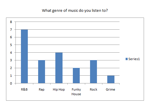
4.       What genre(s) of music do you listen to?
R&B            Funky house            Hip Hop            Rap            Rock            Grime

5.       What TV channels do you prefer to watch?
MTV             TMF            VIVA           BET

6.       How much are you willing to spend on a music magazine?
£1-2              £3-4                £5+

7.       When purchasing a magazine what freebies do you prefer?
Tickets             CD             headphones              T-shirt   
                                                                                                                   
8.       What features do you like to see in a music magazine?


Latest gossip                Posters             Events              Fashion             Interviews 
Horoscopes                  Photos              Adverts

9.       What websites do you usually visit when on the internet?
Facebook                Twitter             Gaming sites             Youtube             Myspace

10.   How often do you attend concerts/gigs?
Monthly                      Yearly                     Never                  Occasionally


11.   How often do you buy music magazines?
Frequently                    Occasionally                  Rarely

12.   Where do you usually purchase your music magazines from?
Supermarkets               Online                Newsagents              Music stores

13.   What are your hobbies?
Dancing                 Singing              Shopping                  Playing an instrument       
               Other _______________________

14.   Who is your favourite artist/band?
___________________________________

15.   What magazines do you usually purchase?
___________________________________